Thursday, April 29, 2010
Monday, April 19, 2010
Monday, April 12, 2010
Hip-Hop
Common - The 6th Sense
People Under the Stairs - Plunken Em
And one of my favorites:
Immortal Technique - Caught in a Hustle
People Under the Stairs - Plunken Em
And one of my favorites:
Immortal Technique - Caught in a Hustle
Thursday, March 11, 2010
Gangs of New York March
When I thought about camera movement, one of the first scenes that came to mind was the opening scene from Scorsese's Gangs of New York. The scene opens with a shot of a young kid named Amsterdam and his father, Vallon, getting ready for a street battle with a rival gang. During this shot, the camera tilts down an ECU of Vallon's face following the razor blade he is using. It then cuts to Amsterdam and his father handing him the razor and tilts and pans to follow the action.
The next shot is where I feel the really great movement begins with the march down the tunnels. It begins with what looks like a dolly out as Vallon and Amsterdam begin the march and combines it with a lot of pans and tilts to show the other gang members getting ready for the battle. At one point (around 1:35) it switches to an almost subjective POV shot behind Vallon and pans right into a side passage, creating a sense that the audience is in the march and looking into the passage as they pass by. The camera then switches back to a more objective view and dolllies out again as more and more people join the march. Also throughout the scene are instances where the camera pans onto a subject, stops, and then continues panning very quickly so that everything blurs out. This helps to establish continuity and fluidity among the cuts between the various gang members in the tunnel. Toward the end of the scene (3:07) it cuts to an impressive crane shot beginning with the gang marching up a set of stairs and then craning back and upward to show the huge wooden structure they are all inside.
This opening scene is only one instance in this movie of what I consider great camera movement. There are really any numbers of scenes that could be used as examples, such as the battle scene immediatately after the opening. The important thing is that all of the movement is motivated, either by following the action of the actors or by an attempt to create energy such as the handheld shots during the fight scenes.
Tuesday, March 9, 2010
Displaced
The film Displaced is about a father and son hiding in the basement of a jazz club in Paris. It's a fairly long "short" film, but it contains some very visually compelling shots throughout. The shots that I really like are the ones that take place inside the jazz club. Most of the shots feature a red and amber color palette, which makes the club feel warm and inviting. When contrasted with the darker, cooler shots of other places in the film it makes the club feel like a very "homey" place that you would want to come in to off of a cold street.
There also a lot of practical lights in some of the club shots, and I feel like that creates a lot of interesting lighting situations as the DP has to try and match the lighting with the practicals so that the studio lighting is not obvious. In this case, I feel like the DP did a good job of achieving this effect.
There also a lot of practical lights in some of the club shots, and I feel like that creates a lot of interesting lighting situations as the DP has to try and match the lighting with the practicals so that the studio lighting is not obvious. In this case, I feel like the DP did a good job of achieving this effect.
Thursday, February 25, 2010
Easy Rider
Easy Rider is a movie from 1969 directed by Dennis Hopper, who also played one of the main characters. The director of photography was Laszlo Kovacs. It is a travel film about two bikers who travel from L.A. to New Orleans with the hopes of finding their version of the American dream. It deals with a number of issues that appeared during the 60s, including hippies and drug use and the bigotry of the South.
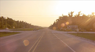
In this particular shot, Kovacs captures a lens flare from the setting sun. This lens flare and the numerous others in the film add a sense of realism to the movie, as if you were really there in that location with the sun shining into your eyes. The highway is also at the very center of the shot, blurring into the horizon in almost the exact center of the screen, which draws the viewer’s eyes down the road. The lines of the road create a sense of distance and evoke the notion of “travel” which is what this part of the scene is about.
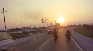
This next shot is shot with the sun almost directly in front of the camera. This causes Wyatt and Billy to go almost completely black, since there is no backlight or fill being used. This shot conjures the image of “riding off into the sunset.”

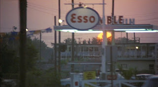
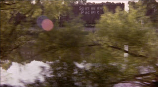
These next shots are all short tracking shots. Like almost all of the other shots in the travel scenes, these shots have long depth of field which keeps the environment surrounding the characters as much in focus as the characters themselves. While it might be distracting in certain other situations, in Easy Rider the landscape is almost as important to the movie as Wyatt and Billy. These shots also add to that sense of realism that I feel Kovacs wanted to achieve by combining a long depth of field with the tracking shots. It makes the viewer feel as if they were actually travelling along with Wyatt and Billy instead of just watching them from some stationary point.
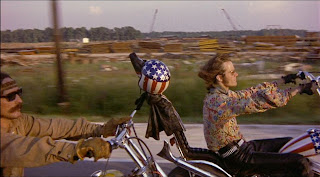
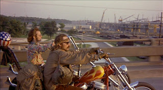
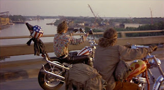
This is another tracking shot, this time with Wyatt and Billy in the frame. Even though they are in the frame however, there is a still a fairly long DoF. This is more of Kovacs’ attempt at making the movie seem real by making it seem as though the viewer is riding alongside them. The light in this shot is also coming from the side and onto their faces, making it seem as if they are riding towards some golden end.
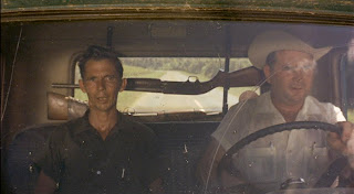
This shot begins the final part of the final scene. The two characters are framed in an MCU so that we can see what type of people they might be, but the characters themselves are framing what our attention is really drawn to, the gun placed in the direct center of the screen. This serves as an ominous foreshadowing for the events immediately following.

This is a tracking shot from the POV of the truck, which establishes the relationship between Billy and the guys in the truck which is important for the following events.
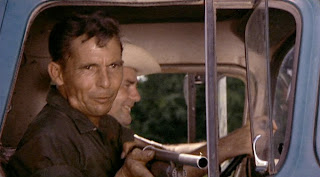
One of the few shots that actually has a shallow depth of field. In this case, Kovacs uses it to draw our attention away from the scenery and to the redneck harassing Billy and the shotgun he now has pointed out of the window. This is also one of the few instances where a character in a closeup is not placed almost directly in the middle of the screen. This guy is placed on the left side, suggesting that he is “evil” (as if the shotgun wasn’t enough).

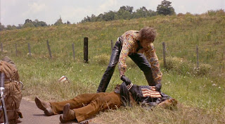
Immediately after the shots of the men in the truck, Kovacs reverts back to using the long DOF. Even though something dramatic has just happened, Kovacs does not choose to place all the emphasis on the characters, even when Wyatt is tending to his dying friend. Instead, Kovacs chooses to maintain the aspect of realism that has permeated the entire movie by showing the events as we would if we were actually there.
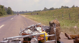
This scene is another one that uses lines to convey depth with a road, but this time attention is drawn to the overturned motorcycle in the middle of the road and frame. While the other similar scene evoked the promise and freedom of the road, this one contrasts it with the tragic events symbolized by the bike in the foreground
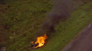
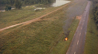

The scene and movie end with these shots portraying the tragic end to both characters travels. The final shot is a long aerial shot that ascends higher and higher over the scene that has just unfolded. This shot serves to “tie it all together” in that it is another shot where the environment is emphasized over the characters. Only this time, it serves to show how small the characters are in relation to everything around them.
Throughout this scene and the entire movie, the major mood or tone that I believe Kovacs was trying to establish was one of realism. He accomplished this by using long DOF and tracking shots to make it seem as though the viewer were seeing it as they would if they were actually there. It is also accomplished with the lighting throughout the movie, which is almost entirely natural. The characters are rarely placed in any sort of special lighting conditions, because doing so might give the film a sense of being “artificial.”

In this particular shot, Kovacs captures a lens flare from the setting sun. This lens flare and the numerous others in the film add a sense of realism to the movie, as if you were really there in that location with the sun shining into your eyes. The highway is also at the very center of the shot, blurring into the horizon in almost the exact center of the screen, which draws the viewer’s eyes down the road. The lines of the road create a sense of distance and evoke the notion of “travel” which is what this part of the scene is about.

This next shot is shot with the sun almost directly in front of the camera. This causes Wyatt and Billy to go almost completely black, since there is no backlight or fill being used. This shot conjures the image of “riding off into the sunset.”


These next shots are all short tracking shots. Like almost all of the other shots in the travel scenes, these shots have long depth of field which keeps the environment surrounding the characters as much in focus as the characters themselves. While it might be distracting in certain other situations, in Easy Rider the landscape is almost as important to the movie as Wyatt and Billy. These shots also add to that sense of realism that I feel Kovacs wanted to achieve by combining a long depth of field with the tracking shots. It makes the viewer feel as if they were actually travelling along with Wyatt and Billy instead of just watching them from some stationary point.


This is another tracking shot, this time with Wyatt and Billy in the frame. Even though they are in the frame however, there is a still a fairly long DoF. This is more of Kovacs’ attempt at making the movie seem real by making it seem as though the viewer is riding alongside them. The light in this shot is also coming from the side and onto their faces, making it seem as if they are riding towards some golden end.

This shot begins the final part of the final scene. The two characters are framed in an MCU so that we can see what type of people they might be, but the characters themselves are framing what our attention is really drawn to, the gun placed in the direct center of the screen. This serves as an ominous foreshadowing for the events immediately following.

This is a tracking shot from the POV of the truck, which establishes the relationship between Billy and the guys in the truck which is important for the following events.

One of the few shots that actually has a shallow depth of field. In this case, Kovacs uses it to draw our attention away from the scenery and to the redneck harassing Billy and the shotgun he now has pointed out of the window. This is also one of the few instances where a character in a closeup is not placed almost directly in the middle of the screen. This guy is placed on the left side, suggesting that he is “evil” (as if the shotgun wasn’t enough).


Immediately after the shots of the men in the truck, Kovacs reverts back to using the long DOF. Even though something dramatic has just happened, Kovacs does not choose to place all the emphasis on the characters, even when Wyatt is tending to his dying friend. Instead, Kovacs chooses to maintain the aspect of realism that has permeated the entire movie by showing the events as we would if we were actually there.

This scene is another one that uses lines to convey depth with a road, but this time attention is drawn to the overturned motorcycle in the middle of the road and frame. While the other similar scene evoked the promise and freedom of the road, this one contrasts it with the tragic events symbolized by the bike in the foreground


The scene and movie end with these shots portraying the tragic end to both characters travels. The final shot is a long aerial shot that ascends higher and higher over the scene that has just unfolded. This shot serves to “tie it all together” in that it is another shot where the environment is emphasized over the characters. Only this time, it serves to show how small the characters are in relation to everything around them.
Throughout this scene and the entire movie, the major mood or tone that I believe Kovacs was trying to establish was one of realism. He accomplished this by using long DOF and tracking shots to make it seem as though the viewer were seeing it as they would if they were actually there. It is also accomplished with the lighting throughout the movie, which is almost entirely natural. The characters are rarely placed in any sort of special lighting conditions, because doing so might give the film a sense of being “artificial.”
Tuesday, February 16, 2010
Night Photography
I've never been much of a "student" of photography or anything, but some of my favorite shots are by a night photographer named Noel Kerns. The thing about his photos are that they are all shot at night, but contain tons of color. He does all of this for the camera using strobes, gels, and long exposure times. None of the effects are put in after the shot is taken with Photoshop or anything like that.
Here's one of his most recent photos:

What I really find interesting about this shot is that even though it's shot at night, the way he uses light it makes it seem really bright and surreal. I really like this guy's work because of the things he's able to do with a still camera and simple lights. Here's some more of his work from abandoned buildings (I have a thing for abandoned buildings and urban exploring, if you couldn't tell by now):


I just really love this guy's photography for the things he's able to do with light. He can take a completely dark room or exterior shot, and then transform it into something full of vibrant color and turn it into something beautiful.
Here's my favorite shot of his:

What makes this my favorite photo is that even though it's shot at night, it almost looks like a surreal day shot. The moon is extremely bright and radiates light which makes it look like the sun, and the cloud passing in front of it is a very nice touch. Then there's the city directly through the doorway in the background, which has a beautiful "hazy" feel to it. I also love how there's like 5 different shades of blue in the background, starting with a light and hazy look and turning into a deep solid blue around the edges. That sort of change in shade is even more amazing to me considering that this was shot at night when everything normally would appear all black or dark.
Here's one of his most recent photos:
What I really find interesting about this shot is that even though it's shot at night, the way he uses light it makes it seem really bright and surreal. I really like this guy's work because of the things he's able to do with a still camera and simple lights. Here's some more of his work from abandoned buildings (I have a thing for abandoned buildings and urban exploring, if you couldn't tell by now):
I just really love this guy's photography for the things he's able to do with light. He can take a completely dark room or exterior shot, and then transform it into something full of vibrant color and turn it into something beautiful.
Here's my favorite shot of his:
What makes this my favorite photo is that even though it's shot at night, it almost looks like a surreal day shot. The moon is extremely bright and radiates light which makes it look like the sun, and the cloud passing in front of it is a very nice touch. Then there's the city directly through the doorway in the background, which has a beautiful "hazy" feel to it. I also love how there's like 5 different shades of blue in the background, starting with a light and hazy look and turning into a deep solid blue around the edges. That sort of change in shade is even more amazing to me considering that this was shot at night when everything normally would appear all black or dark.
Subscribe to:
Comments (Atom)

